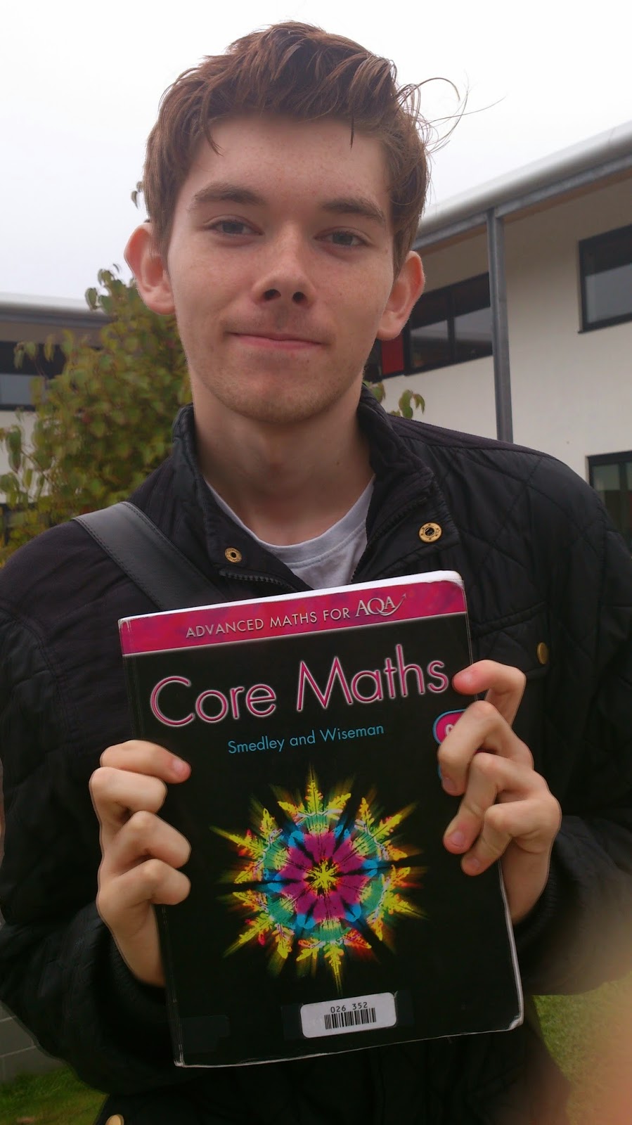
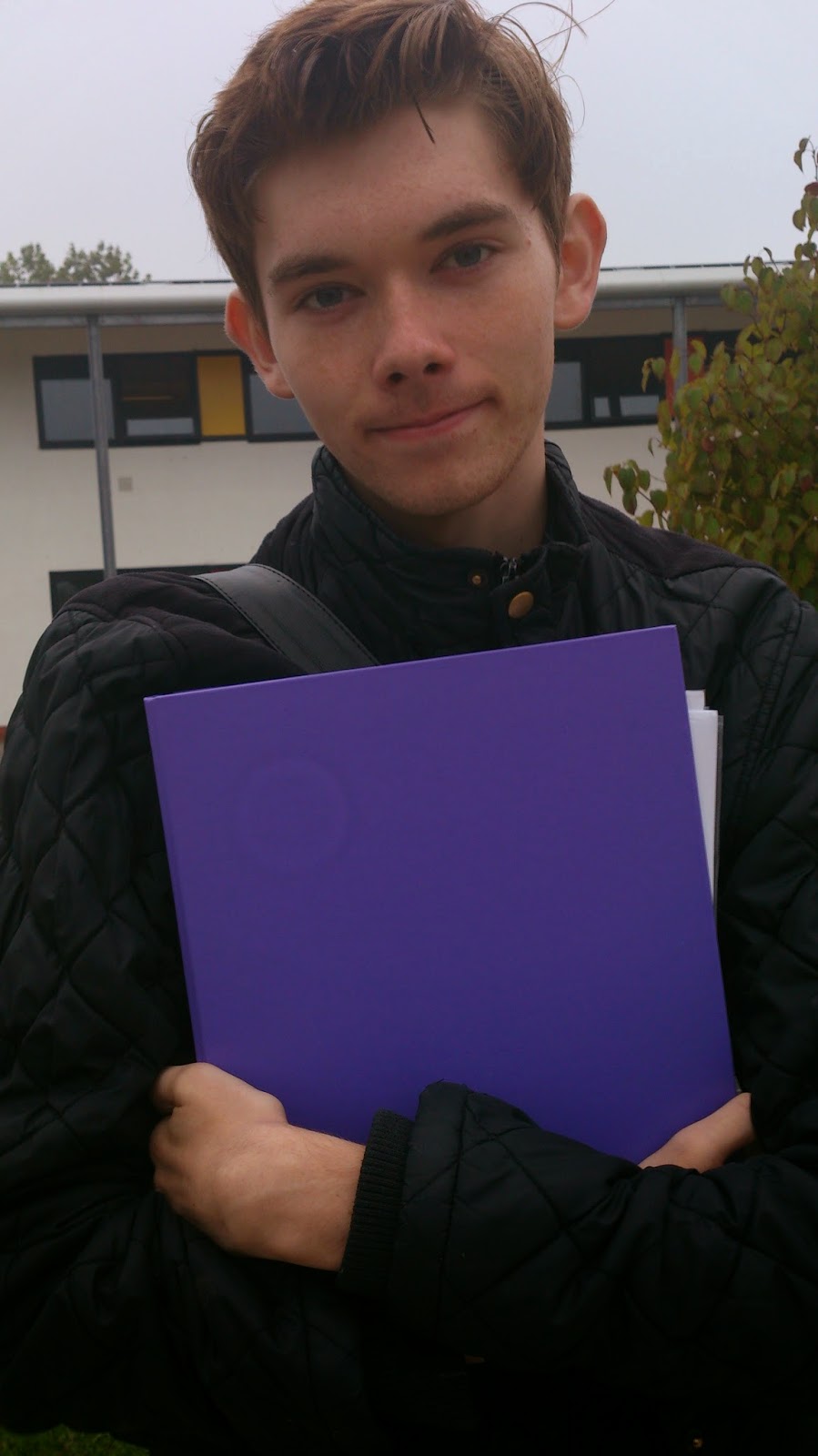
On all the above images there is text on the items my model is holding therefore I would be unable to write my feature stories on top of it as the two pieces of text would be competing with each other.
At this point I was still undecided as to what my magazine would about, therefore I had him holding a range of things, some related to certain subjects and the other objects was pieces of college equipment. The bottom six images also had writing on therefore I am also unable to use them.
In all the above images with my male model I haven't left any room above him for the masthead of my magazine therefore I took different photos of a different model since we were both available again at the same time prior to the coursework due date.
On the above photo there is a lot of shadow on the left side of my model, therefore if I use this photo I'd have to find some way to edit it.

The above image is not a good photo as it is blurry, therefore I will discard this photo when picking which photo I will use for my front cover.
In the above photo my models face has a shadow on it so it may not be a good photo for my front cover.
In this photo there seems to be a pink tint on my models face therefore I will not include this photo whilst picking the one I will use for my magazine.
The light in the above photos may cause a problem but I will not know until I attempt to edit one.
All of my images are medium close ups as this is conventional of a magazine cover, the images of my female model were not taken at the college therefore I will have to edit them and use Photoshop to make it look as if she is at the college or I could have the image on a blank background. Since by this point I had decided my magazine would be based on performing arts, I have taken photos of my model learning a script and playing the violin.


